

A digital presence is a must-have for every business across all industries. Whether you’re a...
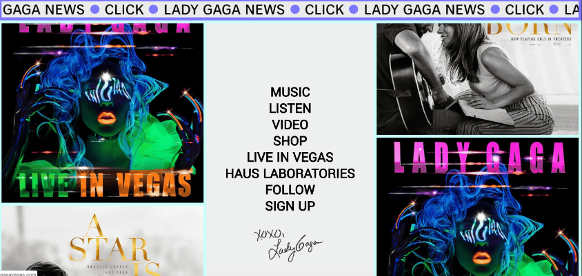
ladygaga.com
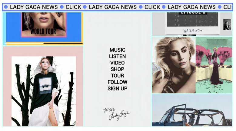
Leave it to a unique artist to have a homepage like this one. Below a clickable ticker tape for news lies a 3-column design. The middle navigation stays fixed while both bordering columns slowly scroll to display various content. This format allows the artist to display a wide range of photographs, GIFs, clickable links to music videos, and more. While the site is busy, we can't deny it's very Gaga and super creative.
blueapron.com
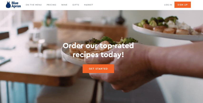
This website is a perfect example of how top notch video production can entice customers. I mean, we can't lie, we're starving after watching them prepare that delicious food! The food delivery service’s homepage begins by placing you in the first person view of a happy customer. Visitors to Blue Apron’s site get a glimpse into what it would be like to receive their fresh, weekly ingredients. Below this photo is an animated explanation of their value proposition, which expands as you scroll down.
hugeinc.com
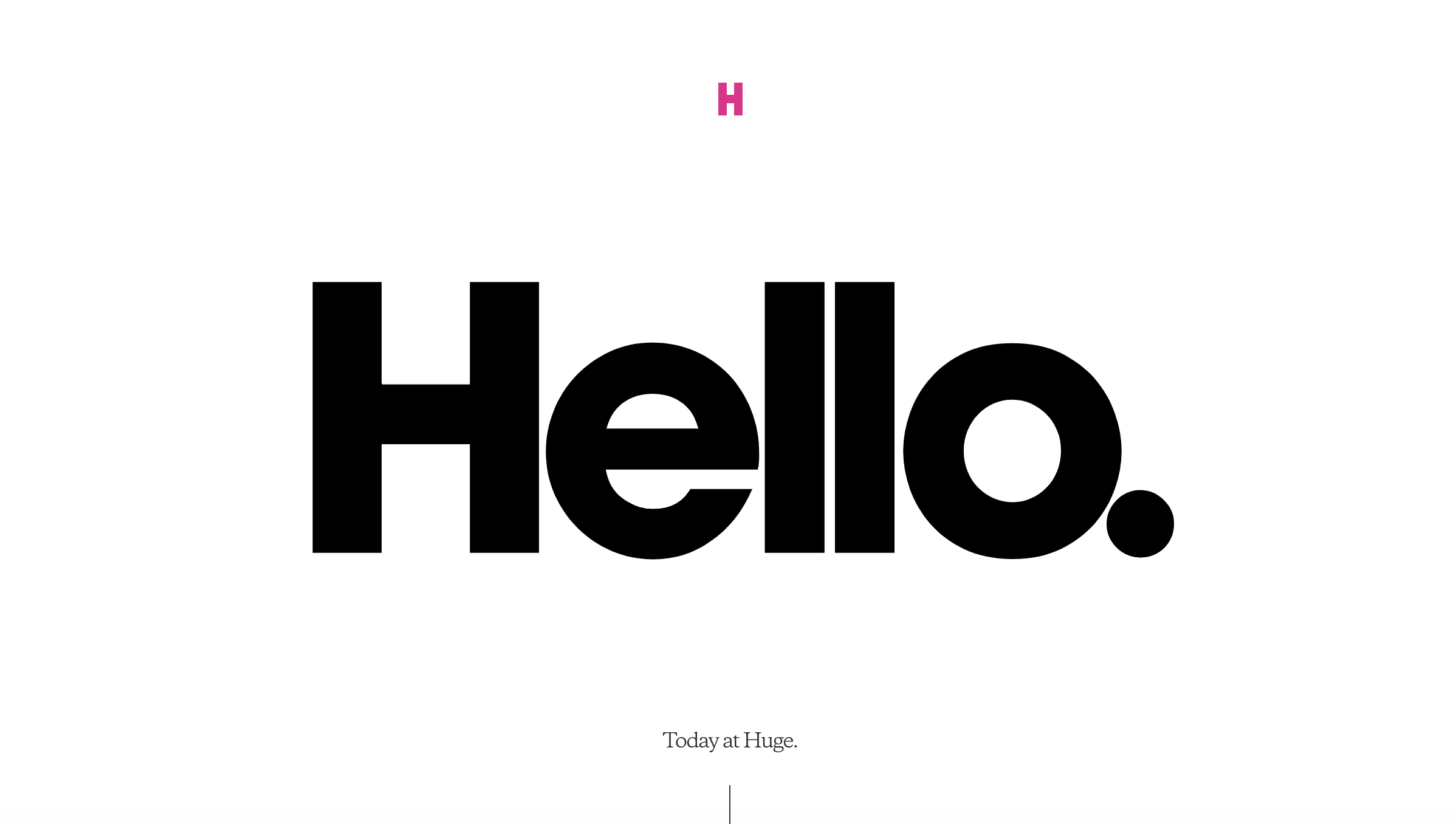
Not going to lie, we're digging this minimalistic vibe. Agencies often have to choose between highlighting their brand and highlighting their work. The HUGE agency found a creative and compelling way to display both: they use elements of their different projects to form their own “H” logo.
justintimberlake.com
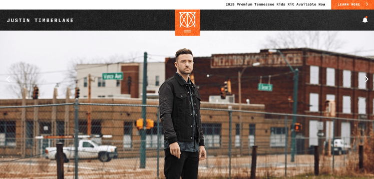
Justin Timberlake’s homepage has a clean design that highlights both his previous and upcoming works. The large featured image gets you to follow his eyes towards the slim navigation bar, which directs to pages full of album covers, movie posters, and so on. This site minimizes the number of calls-to-action and focuses instead on nostalgia-inducing imagery.
reestart.com
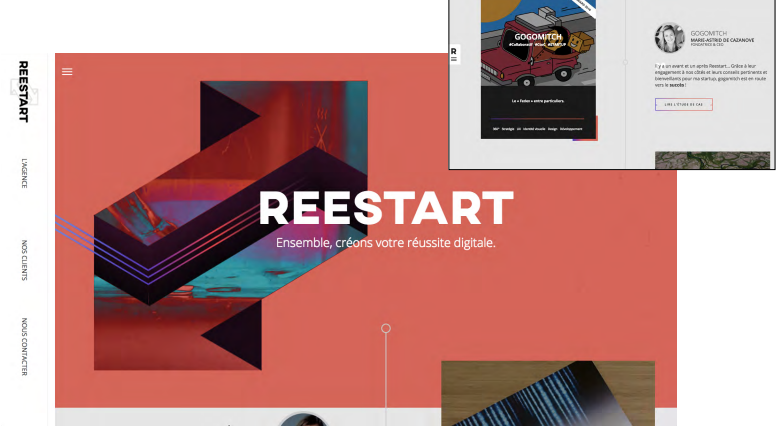
This French agency’s distinctive homepage all starts with colorful, trippy animations within their logo. Inception? As you scroll down the page, client recommendations slide in from both sides and feature the agency’s work. Putting faces to each recommendation immediately builds trust and pulls visitors in.
At ThrivePOP it is important to consider the audience you are trying to communicate with when developing a website. Not only does the website need to be beautiful, it also needs to provide valuable content, easy user interface, and well as nice calls to action. Find out what needs are vital when considering website development and website design and what our design process looks like when creating a website.
Want to revamp your website with an amazing design? We got you. Head over to our Website Development Page to find out more.

